This is an old revision of this page, as edited by JonH (talk | contribs) at 20:38, 23 October 2008 (→Shaded relief: more about top-left lighting). The present address (URL) is a permanent link to this revision, which may differ significantly from the current revision.
Revision as of 20:38, 23 October 2008 by JonH (talk | contribs) (→Shaded relief: more about top-left lighting)(diff) ← Previous revision | Latest revision (diff) | Newer revision → (diff)
Terrain or relief is an essential aspect of physical geography, and as such its portrayal presents a central problem in cartography, and more recently GIS and 3D Visualization.
The most obvious way to depict relief is to imitate it at scale, as in molded or sculpted solid terrain models and molded-plastic raised-relief maps. Because of the disparity between the horizontal and vertical scales of maps, raised relief is typically exaggerated.
On flat paper maps, terrain can be depicted in a variety of ways, outlined below:
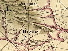
Hill profiles

The most ancient form of relief depiction in cartography, hill profiles are simply illustrations of mountains and hills in profile, placed as appropriate on generally small-scale (broad area of coverage) maps. They are seldom used today except as part of an "antique" styling.
Hachures

Hachures are also an older mode of representing relief. They are a form of shading, although different from the one used in shaded maps. They show the orientation of slope, and by their thickness and overall density they provide a general sense of steepness. Being non-numeric, they are less useful to a scientific survey than contours, but can successfully communicate quite specific shapes of terrain.
Hachure representation of relief was standardized by the Austrian topographer Johann Georg Lehmann in 1799.
Contour lines

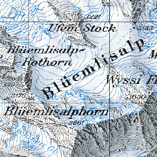
Contour lines (or isohypses) are isolines showing equal elevation. This is the most common way of numerically showing elevation, and is familiar from topographic maps.
Most 18th and early 19th century national surveys did not record relief across the entire area of coverage, calculating only spot elevations at survey points. The United States Geological Survey (USGS) topographical survey maps included contour representation of relief, and so maps that show relief, especially with exact representation of elevation, came to be called topographic maps (or "topo" maps) in the United States, and the usage has spread internationally.
On maps produced by Swisstopo, the color of the contour lines is used to indicate the type of ground: black for bare rock and scree, blue for ice and underwater contours, brown for earth-covered ground.
There are several rules to note when viewing topographic maps:
- The rule of V's: sharp-pointed vees usually are in stream valleys, with the drainage channel passing through the point of the vee, with the vee pointing upstream. This is a consequence of erosion.
- The rule of O's: closed loops are normally uphill on the inside and downhill on the outside, and the innermost loop is the highest area. If a loop instead represents a depression, some maps note this by short lines radiating from the inside of the loop, called "hachures".
- Spacing of contours: close contours indicate a steep slope; distant contours a shallow slope. Two or more contour lines merging indicates a cliff.
Of course, to determine differences in elevation between two points, the contour interval, or distance in altitude between two adjacent contour lines, must be known, and this is given at the bottom of the map. Usually contour intervals are consistent throughout a map, but there are exceptions. Sometimes intermediate contours are present in flatter areas; these can be dashed or dotted lines at half the noted contour interval. When contours are used with hypsometric tints on a small-scale map that includes mountains and flatter low-lying areas, it is common to have smaller intervals at lower elevations so that detail is shown in all areas. Conversely, for an island which consists of a plateau surrounded by steep cliffs, it is possible to use smaller intervals as the height increases.
Hypsometric tints

Hypsometric tints are a variant on contour lines. They depict ranges of elevation as bands of color, usually in a graduated scheme.
The Scottish map firm John Bartholomew and Son is credited with popularizing the technique, and its color scheme has become conventional: dark greens at low elevations, progressing through yellows and ochers, to browns and then grays and white at the highest elevations.
Hypsometric tinting in maps is often accompanied by bathymetric tinting in oceans, which indicates depths using a similar method
Shaded relief

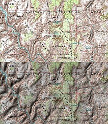
Bottom: the same map with sun shading
Shaded relief, or hill-shading, simulates the cast shadow thrown upon a raised relief map, or more abstractly upon the planetary surface represented. The shadows normally follow the convention of top-left lighting in which the light source is placed near the upper-left corner of the map. If the map is oriented with north at the top, the result is that the light appears to come from the north-west. Many people have pointed out that this is unrealistic for maps of the northern hemishere, because the sun does not shine from that direction, and they have proposed using southern lighting. However, the normal convention is followed to avoid multistable perception illusions (i.e. crater/hill confusion).
Traditionally drawn with charcoal, airbrush and other artist's media, shaded relief is today almost exclusively computer-generated using digital elevation models, with a resulting different look and feel. Much work has been done in digitally recreating the work of Swiss master Eduard Imhof, widely regarded as the master of manual hill-shading technique and theory. Imhof's contributions included a multi-color approach to shading, with purples in valleys and yellows on peaks.
The use of illumination and shadow to produce an appearance of three-dimensional space on a flat-surfaced map closely parallels the painting technique known as chiaroscuro.
Physiographic illustration
Pioneered by Hungarian-American cartographer Erwin Raisz, this technique uses generalized texture to imitate landform shapes over a large area. A combination of hill profile and shaded relief, this style of relief representation is simultaneously idiosyncratic to its creator and very useful in illustrating geomorphological patterns.
More recently, Tom Patterson created a computer-generated physical map of the United States using Erwin Raisz's work as a starting point.
Forums and associations
Portrayal of relief is especially important in mountainous regions. The Commission on Mountain Cartography of the International Cartographic Association is the best-known forum for discussion of theory and techniques for mapping these regions.
References
- Swisstopo, Conventional Signs.
- Sark (Sercq), D Survey, Ministry of Defence, Series M 824, Sheet Sark, Edition 4 GSGS, 1965, OCLC 27636277. Scale 1:10,560. Contour intervals: 50 feet up to 200, 20 feet from 200 to 300, and 10 feet above 300.
- E. Imhof, Cartographic Relief Presentation, Walter de Gruyter, 1982, reissued by ESRI Press, 2007, ISBN 978-1-58948-026-1, pp. 178-185.
External links
- Interactive shaded relief map (Shaded-Relief.com)
- shadedrelief.com
- reliefshading.com
- Rendering a map using relief shading technique in Photoshop