| Province / Territory |
Tartan |
SRT entry |
Status |
Notes
|
| Alberta |
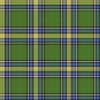 |
Alberta (Province) |
Official; usage can be limited by regulation. |
The idea for Alberta's official tartan began in 1961 at the Edmonton Rehabilitation Society, a charitable organization set up to teach useful skills to the disabled. The tartan was designed by Alison Lamb, the Society's director, and Ellen Neilsen, the weaving instructor, and was officially adopted by the province in an Act of the Legislature on March 30, 1961. The green represents the province's forests, while the gold represents its grain fields. The shade of blue, as well as the gold, are also Alberta's provincial colours.
|
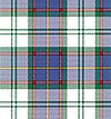 |
Alberta Dress |
Official; usage can be limited by regulation. |
Alberta also has a dress tartan used for formal attire or special events. It contains the same colours as the Alberta tartan with large sections of white.
|
| British Columbia |
|
British Columbia |
Official. |
British Columbia's official tartan was designed by Eric Ward in 1966, to celebrate the 100th anniversary of the 1866 union of Vancouver Island and British Columbia. The government adopted it as the official tartan of the province in 1974. Its main colours are blue and red, representing the Pacific Ocean and the maple leaf, and also contains green for forests, white for the province's official flower, the Pacific Dogwood, and gold from the coat of arms.
|
| Manitoba |
 |
Manitoba Province |
Official; usage can be limited by regulation. |
Manitoba's official tartan was designed in 1962 by Hugh Kirkwood Rankine, and officially adopted by the province in "The Coat of Arms, Emblems and the Manitoba Tartan Act", which received Royal Assent on May 1 of that year. The red in the design originates from the Red River Colony, founded in 1812 by the Earl of Selkirk, Thomas Douglas, and crofters from the Scottish Highlands, and the blue was taken from the Clan Douglas tartan. In addition, the green lines represent the varying cultures and races that make up Manitoban society, and the gold represents Manitoba's agricultural history.
|
| New Brunswick |
|
New Brunswick |
Official. |
The official tartan of New Brunswick was commissioned by William Aitken, Lord Beaverbrook in 1959 and designed by the Loomcrofters in Gagetown, New Brunswick. It was officially adopted as the provincial tartan by an Order in Council in the same year. The "beaver brown" colour was included to honour Beaverbrook, and the red honours the courage and loyalty of the New Brunswick Regiment and Loyalist settlers.
|
| Newfoundland and Labrador |
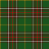 |
Newfoundland |
Official. |
The official tartan of Newfoundland and Labrador was designed in 1955 by Samuel B. Wilansky, a local store owner on Water Street in St. John's. It was registered in the Court of the Lord Lyon in 1973. The white, gold, and yellow come from the province's official anthem, "Ode to Newfoundland":
When sun rays crown thy pine clad hills
And summer spreads her hand
When silvern voices tune thy rills
We love thee, smiling land ...
When spreads thy cloak of shimmering white
At winter's stern command
Thro' shortened day, and starlit night
We love thee, frozen land.
The green represents the pine forests, the white represents snow, the brown represents the Iron Isle, also known as Bell Island, and the red represents the Royal Standard.
|
|
Labrador |
Unofficial; can only be woven by designer. |
The region of Labrador also has its own design of tartan and it was created by Michael S. Martin. The tartan of Labrador, which can be related to Donald Smith, 1st Baron Strathcona and Mount Royal, was sent to the Scottish Register of Tartans. The design is not public and can only be woven by its designer.
|
| Northwest Territories |
|
North West Territories |
Official. |
The idea of an official tartan for Northwest Territories was proposed by Janet Anderson-Thomson after she attended an RCMP ball in 1966 and noticed that the piper was, as she later described it, "terribly drab". She and her husband John, a land surveyor, both discussed the idea with Stuart Hodgson, then Commissioner of Northwest Territories, who supported it. The design was then created by Hugh MacPherson (Scotland) Limited of Edinburgh, a tartan designer and manufacturer, with Anderson-Thomson's colour suggestions: green for the forests, white for snow and the Arctic Ocean, blue for the Northwest Passage and for the rivers and lakes of the region, gold for the territories' mineral wealth, red-orange for autumn foliage, and a thin black line to represent the tree line. The tartan was registered at the Court of the Lord Lyon in 1972, and officially adopted by the Territorial Council in January 1973. By 1976, it was being promoted along with other territorial symbols in official brochures from the NWT government.
|
| Nova Scotia |
 |
Nova Scotia (Province) |
Official; usage requires licence. |
Nova Scotia's tartan was designed by Bessie Murray, the President of the Halifax Weavers' Guild, with the help of Isobel MacAulay, Canada's expert on Clan Systems, tartans and traditional Scottish wear. Isobel was owner of Bond Textiles in Yarmouth, The Tartan House in Halifax, the Gaelic College Craft Centre in St.Anne's, Cape Breton, and was once the president of the Women's Progressive Conservative Party of Canada. Bessie had originally displayed the tartan on the kilt of a shepherd in a panel at a breeders' convention in Truro in 1953, but the design was so admired that it was afterwards used as the province's tartan. Isobel registered the new regional tartan at the Court of the Lord Lyon in 1956, making it the first provincial tartan in Canada, and officially adopted by the province in the Nova Scotia Tartan Act of 1963. Blue are used for the sea; white, for the granite rocks and surf; gold, for the Royal Charter; and red for the lion rampant on the provincial flag.
|
 |
Cape Breton (yellow stripes) |
Unofficial. |
The tartan of Cape Breton Island, an island on the Atlantic coast of Nova Scotia, was designed in 1957 by Elizabeth Grant. Its colour scheme was derived from a 1907 poem by Lillian Crewe Walsh:
Black for the wealth of our coal mines
Grey for our Cape Breton Steel
Green for our lofty mountains, our valleys and our fields
Gold for the golden sunsets shining bright on the lakes of Bras d'Or
To show us God's hand has lingered
To Bless Cape Breton's shore.
|
| Nunavut |
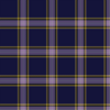 |
Nunavut Territory |
Unofficial. |
Nunavut's tartan design looks to qaujimajatuqangit (Inuit traditional knowledge) in the selection of an eight-colour palette, with white being used for four of the eight colours; dark blue, light purple, yellow and black are the remaining dye lots. The colours were chosen to represent the following: Dark blue – the deep, icy, blue waters, which were and still are vital to the people, and the richness of the blue depicts the richness of the culture. Darker tartans are recognized as being hunting tartans, and with hunting being a large part of the Inuit culture, this is also reflected by the dark blue. White – the use of this colour four times represents the great impact that ice and snow has upon the lifestyle in the north, while depicting the purity of the new territory. Yellow – represents the return of the sun to the north every year, the warmth of its people and the bright future ahead. Light purple – represents the territorial flower, the saxifrage. Black – the vast mineral resources found within the tundra.
|
| Ontario |
|
Ontario (Official) |
Official. |
A tartan called Ensign of Ontario, designed in 1965 by Rotex Ltd, was unofficially used as Ontario's tartan for 35 years. In 2000, MPP for Bruce-Grey-Owen Sound Bill Murdoch introduced the Tartan Act, to adopt a new tartan designed by Jim MacNeil, Chairman of Scottish Studies at Ontario's University at Guelph. The act received Royal Assent on June 23, 2000. The three shades of green represent Ontario's forests and fields; the red, its natives; the blue, its waters; and the white, the sky.
|
|
Northern Ontario |
Unofficial. |
|
| Prince Edward Island |
|
Prince Edward Island |
Official. |
Designed by Jean Reed of Covehead, the official tartan of Prince Edward Island was selected through a contest across the province, and adopted on June 16, 1960. The red-brown represents the famous red soil, the green is for the grass and trees, the white is for the surf, and the yellow is for the sun.
|
|
Prince Edward Island, Dress |
Official. |
|
| Quebec |
|
Quebec, Plaid du |
Unofficial. |
Quebec is the only province whose tartan has not been officially adopted. Known as the Plaid of Quebec (French: Plaid du Québec), it was designed in 1965 by Rotex Ltd, which also designed the tartan of Ontario in the same year. Its colours are derived from the province's coat of arms, with blue from the upper division, green for the three maple leaves, red from the centre division, gold for the crown and lion passant, and white for the scroll containing the province's motto, Je me souviens (English: "I remember").
|
| Saskatchewan |
 |
Saskatchewan |
Official. |
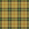
Saskatchewan's tartan was created in 1961 by Mrs. Frank Bastedo, wife of Frank Lindsay Bastedo, former Lieutenant Governor of Saskatchewan. The predominantly yellow palette is meant to represent Saskatchewan's identity as the "breadbasket" of Canada, with gold for wheat and yellow for rapeseed and sunflower. The other colours are green for forests, red for the prairie lily, white for snow, brown for summerfallow, and black for oil and coal.
|
| Yukon |
|
Yukon |
Official. |
The official tartan of Yukon was designed by Janet Couture of Faro in 1965. Its unique colour palette represents various aspects of Yukon's culture: yellow for the Klondike Gold Rush and midnight sun, purple for its mountains, white for snow, blue for water, and green for forests. It was first proposed as the territorial tartan in 1967, during the Canadian Centennial, but was not officially adopted until 1984, when the Yukon Tartan Act was passed by the Yukon Legislative Assembly.
|


 Canada portal